Transforming Pharmaceutical Insights: A Power BI Dashboard Overhaul
A leading multinational pharmaceutical company relied on a Power BI dashboard to track brand performance and drug success. However, the existing dashboard was cluttered and inefficient, requiring up to two days of back-and-forth effort to gather and present data for Monthly Performance Review (MPR) discussions. The goal of this transformation was to create a streamlined, human-centered dashboard that enables leadership to make informed, data-driven decisions in minutes.
Pharmaceutical
UX Designer & User Researcher
Users, SMEs, Stakeholders & Design Leadership
Figma, Miro, MS Teams
Power BI
Challenge
Cumbersome Data Collection: Gathering and validating data required significant manual effort, slowing decision-making.
Cluttered Interface: The dashboard lacked a structured hierarchy, making insights difficult to interpret.
Inefficient Collaboration: Users had to manually compile reports for MPR discussions, leading to delays.
Limited Utilization of Power BI Features: The existing design didn’t fully leverage Power BI’s capabilities for advanced analytics and visualization.
Results
10X Faster Decision-Making: The redesigned dashboard reduced the MPR preparation time from two days to mere minutes.
Enhanced Data Clarity: A structured information architecture and modern design reduced clutter, allowing users to extract meaningful insights quickly.
Improved Collaboration: The dashboard now enables seamless data-sharing, ensuring all stakeholders are aligned.
Optimized Power BI Features: The solution leveraged the latest Power BI functionalities, maximizing operational efficiency.
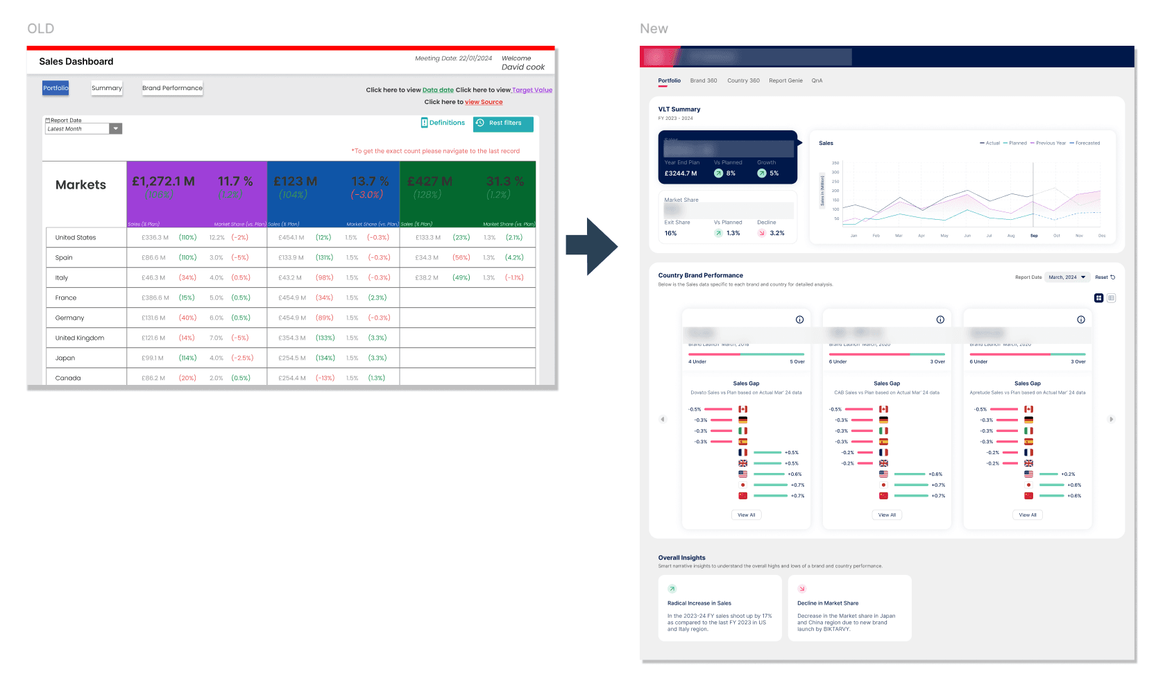
360°view
Brand performance and drug success.
100%
Redundancies and misinterpretations dropped significantly
2 Days
Saved, Eliminated manual effort
foundation
Before starting the redesign, we conducted a UX audit of the existing dashboard. This surfaced several heuristic issues such as cognitive overload, poor hierarchy, lack of structured storytelling, and unintuitive navigation.
We structured the new experience around the 5W1H framework to bring clarity:
Where is the issue?
Why is it happening?
How is it happening?
This foundation shaped our entire design direction.
Process
We followed a human-centered design process: Immerse → Define → Ideate → Prototype → Test → Deploy
IMMERSE
UX Audit Our evaluation revealed:
Overwhelming data density
Ineffective storytelling across metrics
Navigation and layout inconsistencies
These insights guided our research and design priorities.
Stakeholder Interviews We conducted in-depth interviews with 20+ global leaders to understand:
Their decision-making workflows
Current dashboard limitations
Preferred methods of consuming and validating data
DEFINE
Key Insights from Thematic Analysis
Stakeholders struggled to interpret insights quickly
Manual validation created delays
Navigation lacked a “story” or guided path
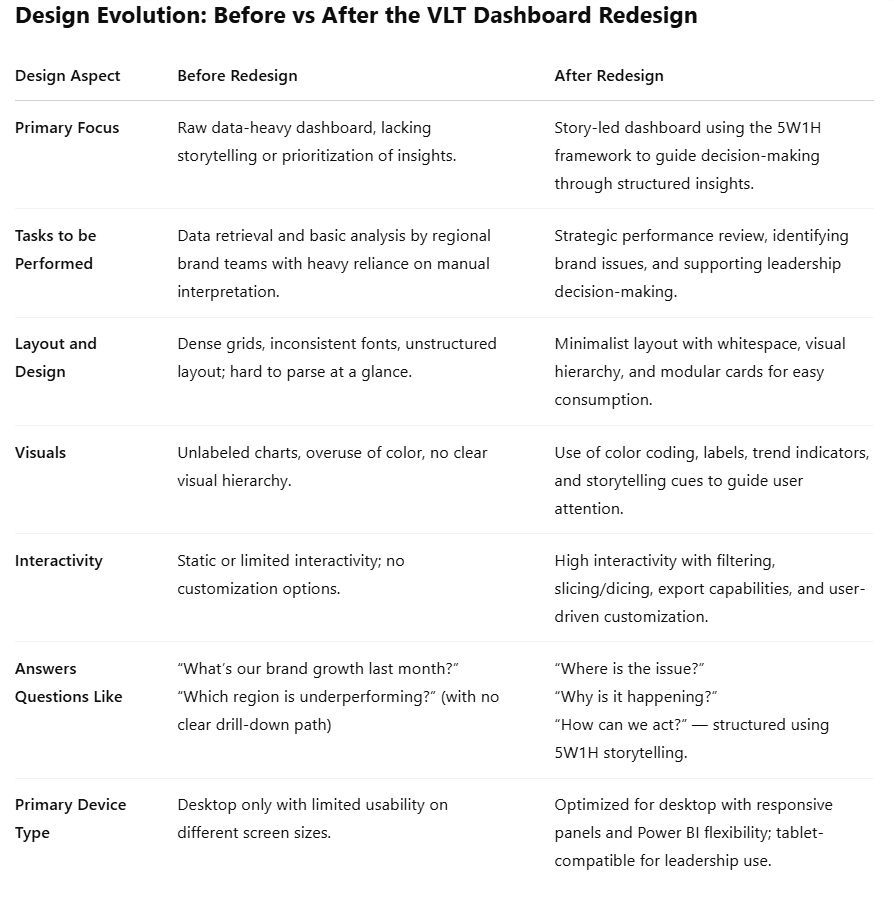
Theme | Core Issues |
|---|---|
Usability | Complex navigation, hard to correlate insights |
Visualization | Visual inconsistency, clutter, lack of context |
Self-Serve | Rigid views, low flexibility |
Collaboration | High manual work, fragmented data sources |
Storycrafting | Lack of narrative tools, static views |
Analysis | No AI summary, poor filtering/slicing options |
Used 5W1H to frame the problem space
Where is the problem? → Across multiple tabs, users were lost in cluttered data layouts. takes about 2 days
Why is it happening? → Lack of visual hierarchy and storytelling cues made it hard to follow a narrative.
Who is it affecting? → Brand directors, business analysts, and global leadership teams.
What is being missed? → Trend insights, root causes, and contextual data were buried.
When does this impact occur? → During Monthly Performance Reviews (MPRs), delaying actions.
How can we fix it? → By restructuring data flow to guide users through Where → Why → How narratives.
Persona Development We Identified three core personas:
Creator-Owner: Manages and uploads validated data
Narrator: Builds the brand’s narrative with the team
Decision-Maker: Reviews metrics to make brand and strategy decisions
User Journey Mapping We mapped the journeys of each persona to identify drop-offs, inefficiencies, and opportunities for UX enhancements.
IDEATE
Ideation Workshop Using Idea Trigger Cards, we:
Explored solution concepts
Co-created features like storytelling flows, one-click brand summaries, and multi-brand comparisons
Introduced Power BI Cards to highlight powerful, underused features
Wayfinding UX Approach We introduced a wayfinding strategy within the dashboard:
Each page had a defined “narrative goal”
Clear progression from macro to micro-level insights
Breadcrumbs and visual anchors improved orientation
PROTOTYPE
Design Principles Adopted:
Minimalist layout with clear hierarchy
Ample whitespace and client branding
Visual storytelling with iconography and color-coded KPIs
TEST
We conducted multiple feedback loops with stakeholders to test:
Ease of use
Time to insight
Memorability and visual clarity
This iterative process helped refine language, labels, interactions, and even chart types.
DEPLOY
Delivery & Implementation
Iterative refinements based on stakeholder feedback
Developer onboarding for Power BI implementation
Final UAT (User Acceptance Testing)
OUTCOMES
Impact Area | Before | After |
|---|---|---|
Decision-Making | Slow, manual | Fast, guided by visual storytelling |
Navigation | Unstructured | Wayfinding with progressive insights |
Data Clarity | Dense, unfiltered metrics | Clean, color-coded insights |
Collaboration | Disconnected updates | Aligned narratives across teams |
What Changed
Decision-makers now navigate the dashboard like a narrative
Cross-functional teams collaborate using shared insights
Redundancies and misinterpretations dropped significantly
“ This new dashboard has completely changed how we work. We used to spend days gathering and organizing data for MPR meeting now, it’s all there in minutes. It’s clearer, faster, and makes decision-making so much easier.”
Senior Leader
Multinational Pharma Company
Conclusion
This transformation turned a time-consuming, complex dashboard into an intuitive and powerful decision-making tool. By aligning with user needs and leveraging modern data visualization techniques, the redesigned dashboard enables leadership to derive meaningful insights rapidly, ensuring timely and effective strategic decisions.